Sunday, 18 April 2010

Planning: Photographs

For my poster and magazine I had to take photographs and decide who I wanted them to be off and the connotation I was trying to portray. From my questionnaire findings the target audience said that would prefer to see a image of the actor on the front page of a magazine and as the main image on the poster. Taking this into consideration I therefore decided to use 'The Caretaker' from our trailer. Throughout the trailer he is kept ambiguous and his face whole face is never shown. I thought it was important for the target audience to see the whole of his face in order for them to connect with the character but at the same time still keeping a sense of enigma.


The Composition of this photograph is effective as the target audience can understand who the character is still allowing them to connect with him but at the same time keeping enimga as his face is not directly looking at the camera. For this reason I choose this image for my poster.


The main feature of the image below is the lighting. This image suggest ambiguity through the lighting however when carried out some research on this image it was clear to see that it wouldn't target my audience as you can't see the character's face. The effect of the lighting is professional looking however the character has it's back turned to the audience which would therefore cause some confusion. Also when analysing existing poster most of the images show the character's face or its easy to identity what they are trying to portray. For this reason I choose not to use this image.


The image below is just a regular close up of the character's face. I thought by using this image it would attract the target audience but still keeping the poster/ magazine simply. However the image is shown to be nothing interesting therefore not showing any emigma. This image doesn't represent my genre the best therefore I choose not to use it.


The image below is a long shot of the character. When analysing exisiting magazine front covers most of the shots used where either medium or close up. Therefore I thought by using a long shot it would be unique to the magazine. It also allows the target audience to see the whole image of the character for example costume and background therefore having a full understanding of the character. Although the image is shown to be dark I have lighten it y using photoshop. For this reason I choose to use this image for my magazine front cover.




Planning: Typefaces & Fonts


These are the typefaces which I have collected for my poster. As I am aware of the conventions for a horror poster I though that the above typefaces will convey my genre the best. In addition by using photoshop to edit the typeface allows teh font to be different and unique. It also allow me to maniupulate the typeface to my own preferences, this again will be linked back to my findings from the questionnaire designed earlier in the research stage in order for me to undestand what my audience require.


I then collected some typefaces which i would use as my masthead from dafont.com. After collecting some example of the kind of typefaced required from my audience i then compared them to real example of existing film magazines. This allowed me gain a professional looking magazine while still trying to convey the right connotations.


Planning: Production Logo

For our teaser trailer we had to design our own production company logo. As a group we decide a effective production company name would be to use the first letters a our names as it has a link to us indivdually. I firstly looked at exisitng production company logo's in order to gain an understanding of what my logo was going to look like. When researching it was clear to see that the logo's were all simple and clear mainly using one image linking to the production company. For example:


To begin with we firstly found a image of a clapper board from google and place our production company name over the top. However after creating our logo we found that we wasn't allowed to use a image from the internet.


We therefore decided to have a logo with just text. We created this logo using Microsoft Word.


After creating this logo and comparing in to existing logo's we found that it wasn't eye cataching or professional looking enough. Therefore we decided to change it to look more eye catching and bolder.

Evaluation: Feedback

Poster Questionnaire Findings


Magazine Findings


Trailer Findings


Evaluation: Final Product

Magazine front cover


Here is a link to my teaser trailer
http://www.youtube.com/watch?v=5RCiqXWlsL4&feature=player_embedded

Here is a link to my evaluation and underneath is the written verison.
http://www.youtube.com/watch?v=muu8KgcgpjI

In what ways does your media product use, develop or challenge forms and conventions of real media products?
For A2 my promotional package was made of up a teaser trailer for a genre of my choice, alongside a poster and front cover of a film magazine. In order for my promotional package to be successful my conclusion was supported by my institutional knowledge which helped me understand how media produce, distribute and share real media products. When conducting research from existing media products I listed the codes and conventions for horror films, teaser trailers, horror film posters and film magazines. This would enable me to portray these conventions in my promotional package in order for my target audience to indentify the genre. However, my media products follows the existing conventions to some extent therefore it can be said that these codes and conventions are challenged.
My teaser trailer can be seen as a ‘stereotypical’ due to the similar forms and conventions used in real media products. For example the camera movement, this range from establishing shots that set the scene to close up that help build intensity and tension. This convention is supported by the face pace editing alongside the increase level of music which gradually builds up. A main convention I found in a horror teaser trailer when researching real media products is that it will slowly build up tension as the action gets faster, the purpose of this is to leave a sense of enigma in the audience head which will result in them wanting to watch the film. I tried to portray this convention to the best of my abililty however it may not be the most successful convention used within our trailer.
In order for us to develop the forms and conventions is by using both a voiceover and music. The trailer starts off with a voiceover typically seen as a males voice in a deep, husky voice which can be seen as a steortypical convention. The purpose of this voiceover was to allow the audience to have a brief understanding of the narrative. Once the voiceover is finished the music then takes over and the transitions and action becomes quicker alongside the music. All these conventions together help build up ambiguity and tension. Therefore it can be said that this convention has developed because when analysing existing teaser trailers they used a combination of Intertitles, music or a voiceover.
When analysing existing film magazines conventions it is clear to see that these conventions are shown in my magazine in order for making it look an authentic magazine front cover. The conventions which are represented in my magazine are the barcode, date, name of publication, caption, skyline, image and teasers. All these conventions work together to help my magazine look professional. The ways in which I have challenged the conventions is from my image, most of the existing media products which i analysed all showed either a medium shot or a close up image, however I used a long shot image therefore it can be said I challenged this convention. This composition is trying to show enigma and ambiguity through the camera angel used.
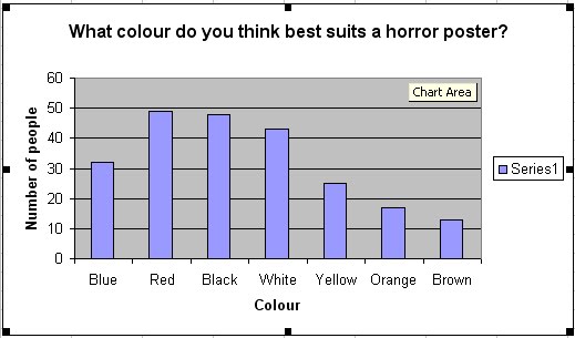
My poster also follows codes and conventions from existing media products. These conventions can be defined as, release date, production company logo, tagline, the name of the film, actors name and a image. My poster challenges conventions again with my image. Most of the existing posters which I have researched all focus the image around the eyes of the characters or use long shots to set the scene, however I have created enigma in my poster by using a sideward image of the character in order to create suspense. I have use the traditional colour convention red, black and white as they all contrast well together and will attract my target audience. When carrying out my audience research my findings showed that these three colours are the most popular and all give the correct connotation for a horror film poster.

How effective is the combinations of your main product and ancillary text?
The combination of my promotional package is very effective as together my main product and ancillary text both represent the horror genre. This effective combination can be due to the three predominate colours red, black and white which I have kept consistence throughout my ancillary text, together these colours give a effective connotation of the horror genre. The image used in my magazine and poster is a key element in linking my main product with the ancillary text as in the main product the character is not shown and kept a secret from the audience and this is maintained in my poster as i used a sideward composition of the character. However in my magazine a long shot is shown of the character therefore he is only revealed in the magazine.
Web 2.0 is ‘the second phase of the internet, where the focus shifts from people receiving information and services to people creating and sharing a material.’ This can be seen as an important part of my promotional package as I would have carried out a viral campaign if given more time. A viral campaign refers to a campaign for a new film which aims to attract an audience solely based on social networking sites such as ‘Face book’ and audience generates sites such as ‘YouTube’. This would mean promoting the trailer via the internet adopting a new technology mainstream approach ‘above and below the line’ marketing techniques.

How did you use new media technologies in the construction and research, planning and evaluation stage?
In order for my promotional package to be successful I had to undertake a sufficient amount of research and planning, this required me to use my existing media skills alongside learning new media skills. This process of using new media technologies was vital as all our coursework had to be submitted electronically. Throughout the research stage I used the internet to find existing media products from the internet particularly search engines such as ‘Google’ and when I was analysing conventions from teaser trailer I used ‘YouTube’. For the planning I mainly used ‘Microsoft Word’ to construct flat plans, mood boards and other written elements such as character profile, narrative structure and risk assessments. Another part of the planning was to create a storyboard which as a group we draw then scanned into the computer. From this we then created an animatic using ‘Windows Movie Maker’.
For the construction stage I used ‘Photoshop’ for my magazine and poster which allowed me to manipulate my image for fit my genre. I also used the internet and the website dafont.com and 101font.com for the typeface on my ancillary text. For my teaser trailer, I used video camera and DV tapes to capture our footage and then in the post production stage I used ‘Adobe Premier’ to edit our footage adding transitions and music.